Main Office
3600 21 St NE, Calgary, AB T2E 6V6
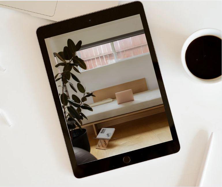
At Software House Canada, we deliver professional mobile-responsive design services to ensure your website performs seamlessly across all devices. Our mobile-first approach guarantees optimal viewing experiences on smartphones, tablets, and desktops. We create responsive layouts that adapt to different screen sizes while maintaining speed, functionality, and visual consistency. Each design is optimized for SEO, fast loading times, and enhanced user engagement. By combining modern UI/UX principles with performance-focused development, we help businesses improve accessibility, reduce bounce rates, and maximize conversions through fully responsive digital solutions.
We work with a wide range of industries including startups, small and medium-sized businesses, real estate, healthcare, education, retail, and professional services.
Absolutely. Every project is tailored to your business goals. We do not rely on one-size-fits-all templates unless specifically requested.
Yes. All our websites are fully responsive, mobile-friendly, and built with SEO best practices to help improve visibility on search engines.
Yes. We offer flexible maintenance and support packages that include updates, security monitoring, performance optimization, and technical support.
Pricing depends on your requirements, features, and timeline. We provide transparent, customized quotes after an initial consultation.
Project timelines depend on scope and complexity. A standard website typically takes 3–6 weeks, while mobile apps or custom web applications may take 3–12 months or more.
Yes. We specialize in website redesigns, performance improvements, UI/UX enhancements, and upgrading legacy systems.
You can contact us through our website or schedule a free consultation. We’ll discuss your goals, suggest the best solutions, and provide a clear roadmap for your project.
5 out of 5 stars on google
5 out of 5 stars on facebook/p>
5 out of 5 stars on Clutch
5 out of 5 stars on BBB